Hello everyone, do you have interest on GNU image manipulation?Let me show you get the GNU image manipulation program and give you a basic understanding of how to use the program for things like editing images and photos. So, we’re going to keep the focus of this content on the most important tools inside of GIMP. Allow me to inform you that we won’t cover everything but you will get a good idea of where you can go from here.
So, if you want to start on a new image document inside the Gimp, there’s the mini bar up at the top like many other programs. When you want to start a new document, you can go to your file and then new or you can hit ctrl n at the same time as a hotkey combination. At the time of doing this, it will give you the editing option to create a new image window. So, by default you’re going to have image size width which is talking about the distance in terms of pixels from this side to this side.
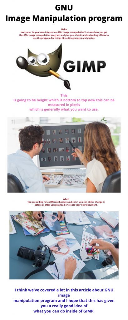
This is going to be height which is bottom to top now this can be measured in pixels which is generally what you want to use. In case, you’re only worried about digital formats but if you need to print anything out later you may prefer to do something like inches. Later, customize the pixels per inch. Go to Advanced options here you can see that you can change the pixels per inch which you might want to make something like 300 if you’re trying to do a very high quality print out of an actual image for instance.
Let’s say you’re making a poster that would be an example of when you need to change it from pixels to inches. In some cases, you’re on the metric system centimeters or meters but here we’ll go back to pixels for now and we can return the image size to something more reasonable. The thing is for instance I often do things at 1920 by 1080 pixels because that’s the standard 1080p resolution for video. The thumbnails that you might see on a YouTube video also in the Advanced Options you may notice that the default fill is the background color.
That is going to be whatever color you have selected here and this tool sidebar. Hence, the color that’s behind is always the background color so that means if I create this it’s going to be created with background color white. If I hit OK here we get a new image document with a background layer and that background is white.
When you are willing for a different background color, you can either change it before or after you go ahead or create your new document. Also one thing that’s very important here is that there is a switch button. You ever want to change the foreground and the background colors you can just hit this little tool right here.
| CLIPPING PATH SERVICE | Best Photo editing service provider we offers photoshop clipping path service 25¢. More are background remove, image masking, photo retouching |
|---|---|
| BACKGROUND REMOVE SERVICE | removal services lets jump CUSA for best quality. |
| PHOTOSHOP MASKING SERVICE | Photoshop Image Masking Service like product masking, object masking, hair masking, fur masking at affordable price with CLIPPING USA |
| PHOTO RETOUCHING SERVICE | Professional Photo Retouching services, 100% Quality Guaranteed try it free for 24 hours. Ensure best quality great service with best price. |
| NATURAL SHADOW SERVICE | Natural Shadow creation service by photoshop expert onlne. Get a creative shadow service for an image at affordable price - CLIPPING USA. |
| PHOTO RESTORATION SERVICE | It seems you are willing to find out high quality photo restoration service. You have arrived at the perfect place. Who doesn’t want to keep collection of |
| COLOR CORRECTION SERVICE | Professional color correction service start with $0.15. If you need photography, product, hair color correction in affordable price get free trail now. |
| NECK JOINT SERVICE | We offer neck joint service at low prices and ensure the best quality, ghost mannequin services for product shop owners all kinds of Garments products. |
| VECTOR CONVERSION SERVICE | Are you need 100% hand made raster to vector conversion service, we are offering best qualtifull service in your files with Professional designer. |
Up here, in the top left we have a bunch of very useful tools this is the tools window by the way which if it’s ever missing you can go up to the menu bar at the top and open with Windows dock able dialogs tool options. If you’ve closed it recently you can also find it and recently closed Docs so we’ll try to spend a good portion of the rest of this video going over some of these basic tools. Before we do that let’s go ahead and import an image into this document so that you can start editing it now.
Before you proceed to that let’s talk a little bit about how GIMP documents work and importing an image in talcum. We were to go up to the file menu and save this document. It’s not going to be saving as an image but instead what it’s going to be saving as a dot xcf file. Now, the reason you would want to save as a dot xcf file and not a PNG or jpg image is that these GIMP documents will store information about things like the different layers you have in your document.
You open it back up you can edit the image having all of the changes that you made previously not compiled into one image but actually kept on separate layers. This is really important, if you ever want to make any changes. Let’s say you add some text to an image and then you export it to a PNG changing the tax on that image without ruining the image becomes very difficult.
That’s why layers are so important. So here we’ll just save this document as it’s a tutorial and save it. The information that you will see is the screen right now would be been saved into a dot XTF file which is just the GIMP format. For these documents now if we ever want to export what we currently have showing on screen to a new file an image file we would inset go to file and then export.
So, when you do that you can use one of many diff and for maps generally speaking you’re going to want it to be a dot jpg. If it’s going to be an image that does not require transparency and you want it to be confessed to the smallest file size possible or dot PNG where your image may have transparency in the background. Do you want that transparency to be stored in the image file? Then the png option is available for you.
At the time, you are willing to put an image up on a web page it wouldn’t be a square shape. Instead of that it will show you the areas that aren’t fully transparent so that technically the file is a square image as all images on the computer are but you can give the illusion of it just being whatever shape you have like a local. For instance for now I’m just going to cancel here because we don’t really have anything to export.
Yeah, at this point you might notice that in the file menu there’s not really an import function. You can go to a location on your computer and Windows Explorer or whatever the equivalent is on your operating system and to grab the image. Then just drag it in.
When working on the picture you can use the brush tool in the same manner. You can see that on the edges it gets kind of blurry and if we zoom out it ends up looking like the brush stroke is a lot more natural in many ways. The pencil tool really stands out so if you haven’t needed to know which one you want it’s whether you want completely hard edges. If you want this blur that will help you to determine which tool to use err.
Okay, now let’s talk about adding text into your image so with the text tool which is this ladder here you simply left-click somewhere that you want to add text. It’ll give you this little tiny box with four corners these corners basically represent the boundaries of your text box. When I use the bottom right boundary and I drag this it’s going to extend the textbox now generally. At the time, you type in text to this box it is going to automatically adjust the size of the textbox anyway so in many cases.
You won’t actually have to worry about it but you can use the corners and also the sides to manipulate the size of your text box and determine where it’s going to go on your screen now as far as changing things like the font color the font size. Also the font type is two places you can do that one when you have the text box selected you can change the values of the text. You have in this box for a one time change.
By say typing in the name of the font you want changing the font size or clicking here for the color selector. But that will not apply to the next text box you create. It is only this one you’re currently working on. The other text that you currently have selected inside of that box you can’t have two sets of rules for one tax box.
For instance, if you type in some letters here and then I hit enter create a new line. I select this text. Then I change it to 40 pixels you can see that the font down here gets bigger but the original text stays the same because they didn’t have everything selected. At this point, I only had this and you can confirm that by seeing 18 and 40.
If you want to change it for basically the remainder of this document any new text boxes you create. You should instead change things over here and tool options. Accordingly, I’m going to click on this button here to select the font. In the next step, I’ll just go to one of my favorites and keep it simple baby’s noise which is one font available for free off at dafont.com.
Okay, so is for fonts yes and let’s also make the font size 60 and change the font color to white which is a far more normal font color. You can see that these changes are immediately reflected over here as well because we have obtained anything. When you choose a spot with left click to start typing you can go ahead and type with these new rules.
After this, why not just say new rules and then click a new box and copies over here too as long as we have set these values over here on the left and tool options. It doesn’t matter how many new boxes we create those would be the defaults inside of that box. At this point, we have a very common problem. That is white text against a very white background which makes it very hard to actually read the text.
So, one thing we can do with texts like this instead of changing the font color to a blue like that we can select this text and add drop shadow to it so whenever we create a text box it also creates a new layer over here so these are text based layers and I can right click on one of these layers do alpha to selection if I want to create drop shadow right behind where those texts are.
By doing the texture selection it selects the outer boundaries of the text itself making it the perfect selection to go. Up to filters light and shadow and drop shadow now in most cases I would uncheck allow resizing here before you add drop shadow in because if you allow resizing that means that the canvas of your document can be sized.
Basically, that’s something you want to manually do, not just let the system do for itself if you want the drop shadow to be more obvious you can increase the opacity you can change the color increase the blur radius. Just pretty simple settings there so I’m going to hit OK here. After this, you can see that now we have drop shadow added behind that text it makes it a lot easier to read against that kind of background. We can also do alpha to selection on this text box go up to filters. Since, we just used the drop shadow effectwe can copy that drop shadow effect one more time by hitting repeat drop shadow.
We get the same effect on that text box too. That’s why I’m going to delete this box down here. In this case, we can start talking about some selection tools so the two primary ones you have for simple shape selections our rectangle select tool and ellipse select tool. So, as these icons might imply rectangular select tools can be squares but also other rectangle shapes as long as it has four corners where the length of opposite sides are equal.
Then yeah the ellipse select tool which can make a perfect circle but it can also make any oval based shape. So, let’s say that we think that this text still doesn’t show up well enough. Therefore, we want to put like a background behind it what we can do is go over to the layers window hit this new layers button for that selection. At this point, with the rectangle select tool we can left-click and drag a rectangle box around that text.
What you can do now is to right-click it goes to edit and then fill with foreground or background color and by doing that we basically take the selection. We turn it into an actual colored box for our document. This is on a new layer one thing to note here is that this layer is above the church layer. You are to bring this box black box layer below the church layer it becomes invisible. The reason is the church layer has zero transparency. So, you can’t see it at all so note that the layer order really matters so let’s do it one more time with the new walls using the ellipse select tool.
In this step, I’m going to move it using the move tool which you can select with M on the keyboard or its right here in the tools panel. I’m going to drag it to kind of Center it kind of with the text that’s below it note that this leaves the drop shadow behind because the drop shadow was created on its own layer that’s not really a problem though because we can just via add the drop shadow . Here, I’m going to delete the drop shadow one which corresponds with the new rules.
I’m going to offer to selection and we will repeat the drop shadow. Just add it back in so now with the ellipse select tool that I can drag an oval around that text. I can also adjust the sides of the oval and the same way you can adjust the text box for text to kind of make it more evenly distributed on all four sides. You can go to new layer to create a layer where we actually want to put this on.
I’m going to put it below the text because I want the text to show over this layer fill because I want the layer fill to hide behind the text. Now, let’s actually change the color from white here for four grounds to something else let’s make it kind of a darkish blue just something to make it different than the black box down here. You will repeat the same process so right click at it fill with foreground color.
Now, we have a blue ellipse where the text is sitting on top of. If we zoom in you can still see that the drop shadow is showing there because if the black box background is black and the drop shadow itself is black as well. It’s impossible to tell the difference because it’s the same color okay so a few more useful tools might be rotate scale shear perspective these are tools for manipulating how a layer looks so we’re just going to focus on scale rotate here.
The reason behind it is these other ones are kind of more for faking 3d looks like. Uncertainty, you want to make an image appear on a computer screen you can do with the perspective tool but usually you just kind of want things to be 2d. So, with the scale tool we can take this church layer and we can leave on it if you hold ctrl down. That will scale the same ratio. So that the image keeps its form in shape but if you let go of control you can kind of scale it to whatever sizes you want so I’m going to just scale it down here and shrink it a little bit when you’re satisfied with the new size you can hit scale. Then you will be able to move it a little bit more if we wanted to kind of unintentionally.
I kind of created a border there so now the background layer is actually serving as a porter for this image. That’s kind of cool the rotate tool kind of similar we can left-click on a layer. After this,you can spin it around until it’s got the new shape and the new angle that we’re looking for on this case I’m going to hit cancel there no real need for that okay so let’s see a couple of more tools we can touch on gradients.
Point to be noted here that, it is very similar to your fill bucket except that instead of one color you can have multiple colors and you can have multiple opacity levels. So, you have a lot of different gradients that are by default here. Nevertheless, if you ever wanted to edit a gradient you can select you default from the list here and then you can hit this edit button over here. Where the gradient editor window will pop up over here allowing you to do things like change colors change center points and change opacity for different things but for right now. Let’s just show how a gradient might work. Hence, I’m going to hide the church layer temporarily and I’m going to create a new layer.
This layer is going to be a new background that sits on top of the background layer. That means currently I have the gradient foreground to background color selected. So as to means that the foreground color here is the color on the left and it will transition into the color that’s on the right which is the background color of black. Let’s say we actually make the foreground color this red here. How we can do that is with the color picker tool which is the top right tool on the keyboard.
It will get the color from the layer you currently have selected. Here, the background layer there but if instead you want to sample the complete color with all the layers combined you can check sample merged here. We just want that red color from the background layer. So, now I’m going to go up to the layer two and let’s actually start by copying the color from the foreground to the background.That means I’m going to copy this HTML notation for the red color. I’m going to click on the background color followed by copying thetab to make it update.
At this point, that color has been added in here. Then again I’m gone make it a bit lighter.It ensures that I can go ahead and hit OK here. If we go back to the gradient selector you can see that the gradient will actually painting with is very different than it was before.
The reason is our foreground background colors have changed so now if we left click and we drag a direction it will try to create a gradient by default the shape is linear. That means from the starting point towards the end point will look something like this. You can notice that’s a little bit more interesting than just having one solid color in many cases. However, you can also have different shapes so for instance if you want a square shape where the center point will be where the foreground color is. After this in all directions it becomes the background color on the outside that’s one other shape that’s available to you. I draw a bi linear here at the center point it’s going to have this line here.
Afterwards, on both sides it’s going to start going towards the background color.then again in both directions not just one direction I think most gradients are probably linear though so I’ll just go ahead along with using a linear shape there. Note that the background layer and the original background layer are being completely covered up by this new gradient layer. I’m just going to leave it like that for now. We can layer you can see that the border here is a little bit more interesting.
There is another way that you can add a border in pretty quickly is to go up to the filters menu d4 add border. Formerly to choose a border color so I don’t know we’ll just go with this pink. You for a second you can choose to give it a size so I’ll make it 25 pixels for all sides and hit OK. By doing this does actually increase the size of your canvas so that’s one thing to keep in mind but you can see how it gives you a kind of an interesting border shape on all of the corners using that color it actually creates several different shades of that color.
We are going to hit control Z right now because we don’t really need that so just a couple more tools really quickly. Here are the free select tools if you ever want to draw your own selection by hand around some object. That’s in your screen you can do that just connect them at the end. Then you can it control axe on your keyboard to cut it out completely obviously. That’s a pretty crude way of cutting things out so a better option would be the scissor select tool. Also with the scissor select tool you can just set these key points. GIMP will try to figure out based on the colors in your image where the borders of your object are so you cut around.
Especially, if you go all the way around an object it’ll be useful so if you make a complete selection around the object. You can see that on areas like here where you have the sky and the chimney it really does a decent job of actually making that selection a lot better than you’d probably get freehand. Once your selection is made you can just click inside. It will convert all of those key points to an actual selection. Then you can hit control Z to cut it out by the way let’s say that you didn’t want to get rid of it.
But you just wanted to put it on a new layer well we can move it to a new layer by creating a new layer and then just hitting control V. Now that part of our image is on a completely separate layer which is really useful. You want to make changes to this selection only but not the entire document so just for fun let’s say that one of those ridiculous changes we wanted to make was to blur. It out so the blur and sharpen tool if you want to make something less defined you can use blur which shift you on your keyboard is the hot key.
Here, I’mgoing to drastically increase the size up here just so that you can really see what’s going on at this point. Because we created this separate layer if I blue here which I’ll do by left-clicking now you can see it doesn’t affect the sky in the background. You know having those separate layers is really handy when you’re working inside of gem. Then you can see down here also the bricks below not part of this pasted layer where we’re currently working on.
It is also not going to get blurred out now the opposite of that which you can trigger by hitting ctrl or by changing it by coming down in the tool options now it kind of does the opposite it’s going to take an image which might have some blur and try to sharpen it of course it’s not like an image community add detail that doesn’t really exist there before so ifyou show up in things too much. Beyond where they were originally it might look kind of weird. I don’t honestly use that all that much so if you really want high detail in your images. I would just recommend you get a really good camera.
So, you can see how the gradient from this layer to actually starts to show on the final image even though all layers are enabled for visibility.Therefore,there are applications for that instance if we take these black box layers and make that partially transparent you can start to see things like the sunset to show through this black box.
You can start from the black box though. It now looks greyer behind it. You see the sunset thus likewise we can do the same thing with this blue oval over here. Allowing the background to show through a little bit more and hopefully you can imagine some ideas for we’re having partially transparent layers allows you to make your image a little bit more interesting.
I think we’ve covered a lot in this article about GNU image manipulation program and I hope that this has given you a really good idea of what you can do inside of GIMP.

P.O BOX; 10623
SILVER SPRING, MD. 20914
UNITED STATES.
info@clippingusa.com
+1 240 918 9262, +1 (301) 310 6411
HOUSE # 06, ROAD # 02,
SECTOR # 11, UTTARA, DHAKA-1230,
BANGLADESH.
info@clippingusa.com
+1 240 918 9262, +1 (301) 310 6411
12601 SUMMERWOOD DR,
SILVER SPRING, MD, 20904
UNITED STATES.
info@clippingusa.com
+1 240 918 9262, +1 (301) 310 6411